Looking at bathroom remodeling before-after photos gives you real proof of what’s possible in your space. You see actual results instead of trying to imagine changes from drawings or plans alone. These bathroom renovations show how small changes create big differences. Whether you have a tiny powder room or spacious master bathroom, seeing real transformations helps you plan your own project with confidence.
The most impressive before-and-after bathroom remodel from experienced kitchen and bath contractors will spark your imagination. These bathroom before and after makeovers showcase how professional expertise can turn ordinary spaces into stunning retreats that perfectly blend style and functionality.
Amazing Bathroom Remodeling Before-After Results
Real transformations tell the full story. You see exactly what works and what doesn’t. These bathroom remodeling before-after examples prove that any space works with the right approach.
Project 1: Artistic Statement Wall Transformation
Before
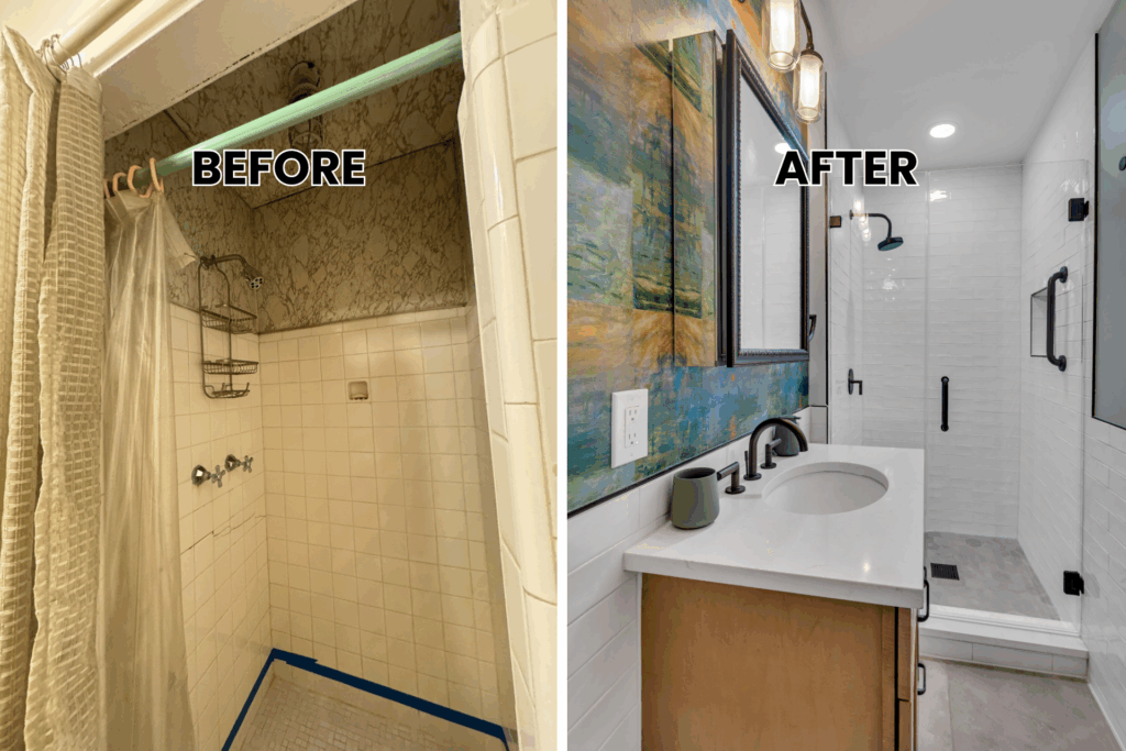
The original bathroom felt cramped and outdated. Basic white subway tile covered the walls without personality. The small wooden vanity provided minimal counter space while old fixtures showed visible wear. Poor lighting made the compact space feel even smaller.
After
This bathroom remodeling before-after shows how bold choices create impact. Artistic statement wallpaper transforms one wall into a focal point with abstract patterns in blues and earth tones. The new brown shaker vanity offers more storage and counter space. White marble countertops pair beautifully with bronze fixtures throughout. Glass shower doors replace the old shower curtain, making the space feel open and bright.
Key Features:
- Artistic wallpaper creates visual interest
- Expanded storage with brown shaker cabinets
- Luxurious marble surfaces
- Glass doors replace shower curtain
This complete makeover proves that statement walls work in small spaces while strategic light placement makes everything feel larger and brighter.
Project 2: Tranquil Blue Small Space Makeover
Before
This small guest bathroom presented typical challenges found in older homes with limited square footage. The cramped layout made daily routines difficult, with barely enough room to move comfortably between the toilet, sink, and tub-shower combo. Basic white walls and standard bathroom features created a sterile, institutional feeling that lacked warmth or personality. Storage remained severely limited, with only a small medicine cabinet and minimal counter space for necessities. The original bathroom design failed to maximize the available space, leaving the room feeling cluttered and unwelcoming despite its compact floor plan. A simple shower stall with worn fixtures completed the uninspiring space.
After
The completed bathroom remodeling before and after showcases how thoughtful design transforms even the smallest powder room into a tranquil retreat. Soft light blue painted walls now create a serene spa-like atmosphere that visually expands the room and adds a fresh look to the entire space. White shaker cabinets provide essential storage without overwhelming the limited square footage, their clean lines maintaining an uncluttered appearance while maximizing functionality. White marble countertops and backsplash reflect light throughout the room while adding natural elegance and plenty of counter space.
Project 3: Modern Efficiency in Maryland
Before
The original bathroom layout wasted valuable space and created daily frustrations for the homeowners in their master bedroom suite. Poor storage solutions meant toiletries and bathroom essentials had no designated home, leading to constant clutter on the limited counter space. The existing materials showed their age with visible wear patterns, stains, and outdated styling that made the entire master bath feel tired and neglected. Inadequate lighting cast unflattering shadows from a basic ceiling fixture, while the overall design lacked cohesion and modern functionality. The cramped feeling persisted despite adequate square footage due to poor space planning and outdated fixture placement. The bathroom needed a complete renovation to match the home’s history and the family’s current lifestyle needs.
After
This bathroom remodeling before-after project prioritizes both function and style through strategic design choices that create a stunning modern retreat. Fresh off-white painted walls brighten the entire space while providing a neutral backdrop for other design elements and creating visual interest through subtle texture. The new wooden vanity with brown shaker cabinets offers abundant storage with deep drawers and organized compartments, eliminating the clutter problems that plagued the original design while providing ample counter space for daily routines.
White quartz countertops provide a durable, stain-resistant surface that maintains its beauty with minimal maintenance, creating a clean white color palette throughout. The matching quartz backsplash creates a seamless, sophisticated appearance while protecting walls from moisture. A chrome faucet adds modern appeal with its clean, geometric lines that complement the overall contemporary style. The square-framed mirror introduces geometric visual interest while providing better light reflection throughout the room. Glass shower doors maximize natural light flow while creating an open, airy feeling that transforms the space into a roomy shower area. Neutral tile flooring provides durability and timeless appeal that coordinates with all other fixtures and finishes.
Project 4: Sleek Contemporary Maryland Transformation
Before
The original master bathroom struggled with outdated beige walls that made the space feel closed in and tired. A standard shower stall with basic fixtures provided minimal functionality while taking up valuable square footage. The existing vanity offered insufficient counter space for a busy household, forcing daily essentials to crowd the limited surface area. Poor lighting from a single ceiling fixture created shadows that made grooming tasks difficult. The overall layout felt cramped despite adequate room dimensions, with wasted space that failed to serve the homeowners’ modern lifestyle needs. Basic builder-grade materials throughout showed their age and lacked the sophistication expected in a master bath.
After
This bathroom remodeling before and after showcases how contemporary design principles create a sleek, functional retreat. Fresh beige painted walls provide a warm neutral backdrop that complements the modern fixtures and finishes throughout. The new brown shaker cabinets with chrome hardware offer abundant storage while their clean lines maintain the contemporary aesthetic. White quartz countertops create a pristine workspace that resists stains and maintains its beauty with minimal maintenance. The matching quartz backsplash extends the seamless appearance while protecting walls from moisture and splashes. Chrome faucets and fixtures add modern appeal with their geometric forms and lustrous finish.
Glass shower doors replace the old shower stall, creating a roomy shower that feels open and airy. New tile flooring provides durability and water resistance while coordinating with the overall design palette. Square-framed mirrors reflect light throughout the space while adding architectural interest. This complete makeover demonstrates how modern materials and thoughtful layout planning transform any master bathroom into a stunning contemporary retreat.
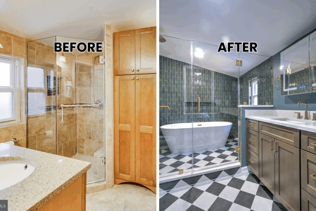
Project 5: Teal Oasis Modern Bathroom in Silver Spring
Before
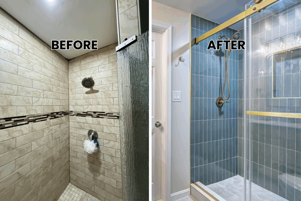
The existing master bedroom suite bathroom suffered from a dated design that failed to maximize the available square footage. Basic beige tile covered the walls and floor in a monotonous pattern that lacked personality and visual interest. The old built in tub dominated the room while providing limited functionality for the homeowners’ daily routines. Outdated brass fixtures showed their age with visible wear and corrosion that detracted from the overall appearance. Poor storage solutions left toiletries and bathroom essentials scattered across minimal counter space. The cramped layout made movement difficult between the toilet, vanity, and bathtub areas. Natural light from the window remained underutilized due to poor positioning of fixtures and the bulky tub installation that blocked sight lines.
After
This bathroom remodeling before-after transformation creates a stunning teal oasis that rivals any luxury spa retreat. Bold, blue painted walls establish a dramatic backdrop that adds depth and personality to the entire space. Rich brown shaker cabinets with gold hardware provide sophisticated storage solutions, while their warm finish complements the cool wall color beautifully. White quartz countertops offer pristine work surfaces that create striking contrast against the deep blue walls. The matching quartz backsplash extends the clean, seamless appearance while ensuring easy maintenance.
A luxurious freestanding tub becomes the room’s focal point, positioned strategically to take advantage of natural light from the window. The walk-in shower features stunning patterned floor tiles in black and white that add geometric visual interest. Glass shower doors maintain the open feeling while containing water effectively. Gold fixtures throughout tie the warm cabinet hardware to the overall design scheme. This bathroom makeover proves how bold color choices and high-end materials create a truly memorable master bath that serves as a daily retreat from busy modern life.
Project 6: Serene Sanctuary High-End Silver Spring Remodel
Before
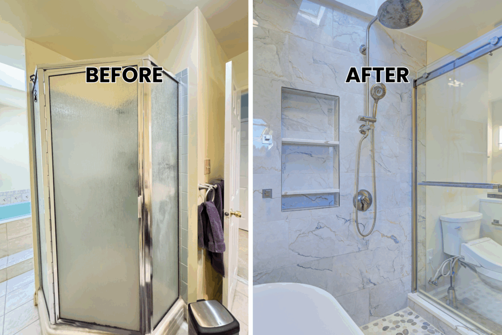
The original master bathroom presented a basic builder-grade design that failed to reflect the homeowners’ sophisticated tastes. Standard shower doors enclosed a cramped shower stall that offered minimal space for comfortable daily routines. The existing double vanity provided inadequate counter space despite its length, with poor organization that created constant clutter problems. Basic lighting from overhead fixtures cast unflattering shadows that made grooming tasks challenging. Dated materials throughout showed wear patterns and lacked the luxury finishes expected in a high-end master bedroom suite. The floor plan wasted valuable square footage with poor traffic flow between the toilet, vanity, and shower areas. Natural light from windows remained underutilized due to awkward fixture placement.
After
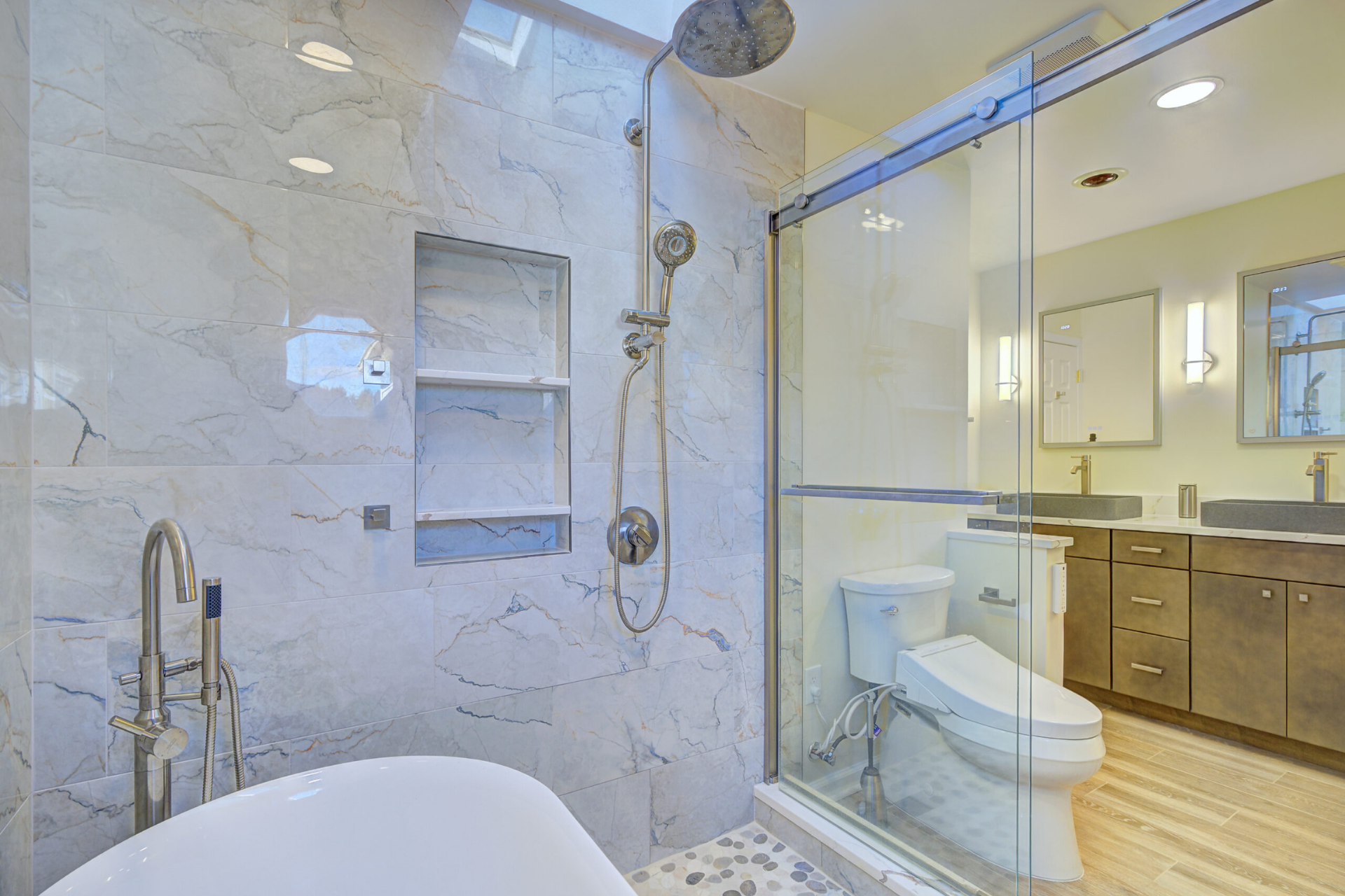
This bathroom remodeling before and after exemplifies luxury design principles applied to create a serene sanctuary worthy of a high-end spa. Sophisticated beige painted walls provide an elegant neutral foundation that enhances the natural materials throughout. Rich brown flat panel cabinets offer abundant storage with their sleek, contemporary lines that emphasize horizontal planes. Bronze hardware adds warmth and sophistication while coordinating beautifully with other fixtures. White quartz countertops create pristine work surfaces that extend seamlessly into the matching backsplash for easy maintenance.
Chrome faucets provide modern functionality with their clean geometric forms. Wood textured tiles throughout the floor add natural warmth while offering superior water resistance. The redesigned shower features sliding glass doors that maximize the roomy shower space while maintaining clean sight lines. Strategic lighting placement eliminates shadows while creating a warm, inviting atmosphere. This complete makeover demonstrates how premium materials and thoughtful space planning transform any master bath into a daily sanctuary that provides both luxury and functionality for years to come.
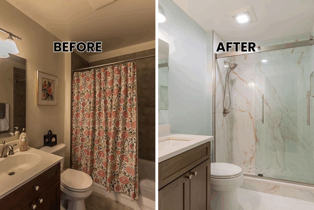
Project 7: Elegant White Marble Bathroom Transformation
Before
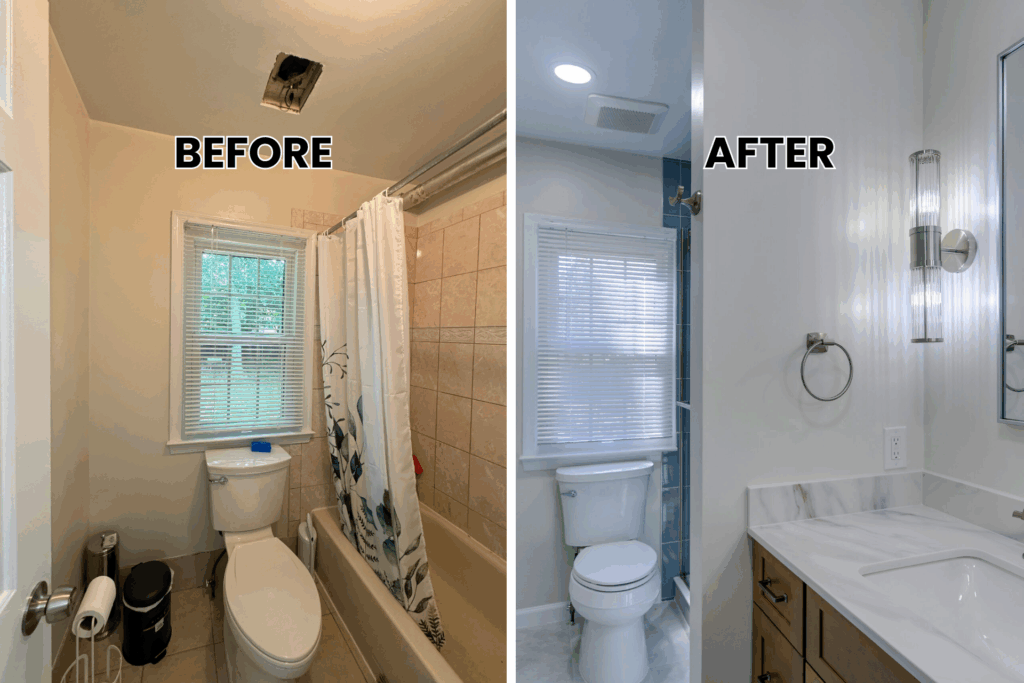
The original guest bathroom featured dark gray painted walls that made the small space feel closed in and uninviting. A basic shower curtain with floral patterns dominated the tub shower combo area, creating visual clutter that competed with other design elements. The existing wooden vanity offered minimal counter space while the outdated fixtures showed their age throughout. Poor lighting from a single ceiling fixture created shadows that made daily routines difficult. The cramped layout failed to maximize the available square footage, with wasted space that prevented efficient movement between fixtures. Basic builder-grade materials throughout lacked the sophistication needed for a modern bathroom makeover.
After
This bathroom remodeling before-after demonstrates how elegant materials create a luxurious retreat. Fresh light green painted walls provide a calming backdrop that makes the room feel larger and more serene. The new brown shaker cabinets with silver hardware offer abundant storage while maintaining clean, contemporary lines. White marble countertops create pristine work surfaces that extend seamlessly into the matching marble backsplash. The undermount sink paired with a gold faucet adds warmth while providing modern functionality.
A floating vanity mirror reflects light throughout the room while adding architectural appeal. Glass sliding shower doors replace the old shower curtain system, creating a roomy shower that feels open and bright. This complete makeover shows how marble surfaces and thoughtful color choices transform any powder room into a stunning focal point.
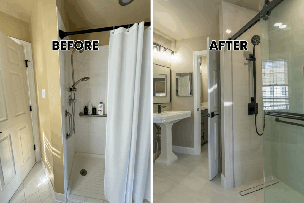
Project 8: White Modern Bathroom Remodel
Before
The existing master bathroom suffered from a cramped floor plan that made daily routines challenging for busy homeowners. Basic white walls and standard fixtures created a sterile appearance that lacked personality and warmth. The old shower stall provided minimal space while outdated brass fixtures showed visible wear and corrosion. Limited storage solutions forced toiletries and essentials to clutter the small counter space available. Poor lighting cast unflattering shadows throughout the room while the overall layout wasted valuable square footage. The bathroom needed a complete renovation to meet modern standards and improve functionality for the household.
After
This bathroom remodeling before and after showcases how modern design principles create functional elegance. Warm beige painted walls establish a sophisticated neutral foundation that complements the rich materials throughout. Dark brown shaker cabinets with black hardware provide ample storage while their deep finish adds dramatic contrast. White marble countertops offer pristine work surfaces that resist stains and maintain their beauty over time. The matching marble backsplash creates a seamless, luxurious appearance while protecting walls from moisture.
A pedestal sink adds classical elegance in the powder room area. Wood textured floor tiles bring natural warmth while offering superior water resistance. Glass sliding shower doors maximize the walk-in shower space while maintaining visual openness. Strategic lighting placement eliminates shadows while creating a warm, inviting atmosphere perfect for a master bath retreat.
Project 9: Luminous Bathroom Remodel
Before
The original bathroom presented unique challenges with its historic character that needed updating for modern living. Dated black and white patterned tiles covered the walls in a busy design that overwhelmed the limited space. The existing pedestal sink provided minimal counter space, while the cramped layout made movement difficult. Poor natural light from the single window failed to brighten the room adequately. Old fixtures throughout showed their age, while the overall design lacked cohesion. The space needed a fresh look that would honor the home’s history while providing contemporary functionality.
After
This bathroom remodeling before-after transformation creates a bright, luminous space that celebrates both classic and modern elements. Clean off-white painted walls provide a fresh backdrop that maximizes natural light reflection throughout the room. Patterned square tiles on the backsplash add visual interest without overwhelming the clean design palette. The updated pedestal sink maintains the classic aesthetic while chrome fixtures provide modern functionality and durability. New patterned floor tiles introduce subtle texture that coordinates with the wall treatments.
A floating vanity mirror reflects light strategically while adding contemporary appeal. Chrome hardware throughout maintains the bright, cohesive appearance while providing long-lasting performance. This budget-friendly renovation proves how simple material updates and fresh paint create huge impact in any space. The luminous result demonstrates how thoughtful design choices honor a house’s architectural character while meeting modern needs.
Project 10: Sleek Modern Bathroom Remodel in Silver Spring
Before
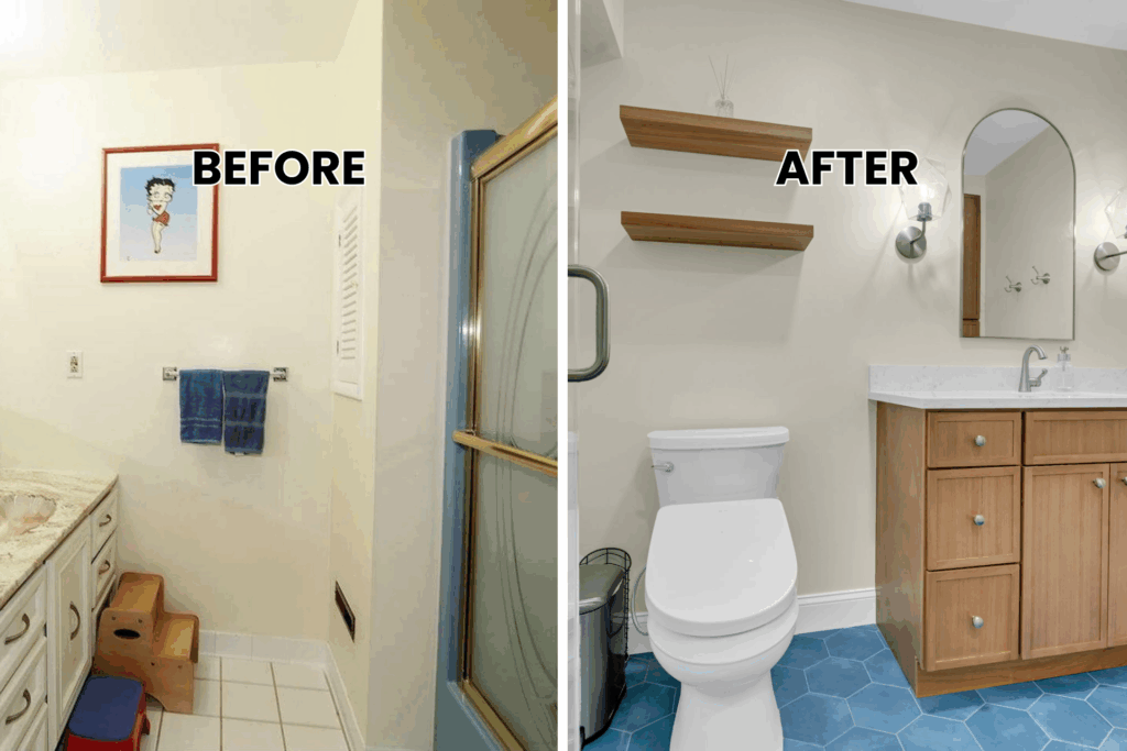
The original master bathroom suffered from an outdated design that failed to serve the homeowner’s daily needs effectively. Bright blue painted walls created an overwhelming visual impact that made the space feel smaller and more cramped. Basic white tile covered the floor in a standard grid pattern without any personality or visual interest. The existing layout wasted valuable square footage with poor traffic flow between the toilet, shower, and vanity areas. Outdated brass fixtures showed their age with visible corrosion and wear patterns throughout. A simple shower curtain enclosed the tub shower combo, creating a dated appearance that detracted from the room’s potential. The bathroom needed a complete renovation to transform it into a modern, functional space worthy of the master bedroom suite.
After
This bathroom remodeling before-after transformation showcases how sleek, modern design creates a sophisticated retreat. Fresh beige painted walls provide a calming neutral backdrop that makes the space feel larger and more serene. The new brown shaker cabinets offer abundant storage with their clean, contemporary lines and multiple drawers for organized storage. White quartz countertops create pristine work surfaces that resist stains while maintaining their beauty over time. The matching quartz backsplash extends the seamless appearance while providing easy maintenance and moisture protection.
Stunning blue bathroom tiles on the floor introduce a pop of color that adds personality without overwhelming the neutral palette. Glass shower doors replace the old shower curtain system, creating a roomy shower that feels open and bright. Floating wooden shelves add both storage and visual interest while maintaining the clean aesthetic. Strategic lighting placement eliminates shadows while creating a warm, inviting atmosphere. This complete makeover demonstrates how thoughtful material selection and modern fixtures transform any master bath into a daily sanctuary that combines style with practical functionality.
Planning Your Perfect Bathroom Remodel
These bathroom remodeling before-and-after examples show amazing results, but every successful project starts with smart planning. You need the right approach to turn your vision into reality. Here’s how to plan your transformation.
Set Clear Goals
Define your needs before selecting materials. Consider how you use the space daily and what changes would make the biggest impact on your routine.
Budget Wisely
Quality materials and professional installation create lasting value. Prioritize high-impact changes that deliver both immediate satisfaction and long-term durability.
Choose Professional Expertise
These bathroom remodeling before-after results require skilled craftsmanship and design experience. Professional contractors coordinate trades efficiently while maintaining quality standards.
Every successful transformation starts with expert guidance. Let our experience guide your project from concept to completion.
Your Transformation Starts Here
These bathroom remodeling before-after examples show what’s possible when vision meets expertise. From small powder rooms to luxurious master bathrooms, the right approach transforms any space into a daily retreat.
Mega Kitchen and Bath brings proven results to Maryland homeowners. Our portfolio demonstrates consistent quality across diverse styles and budgets. We understand local building requirements and work efficiently to minimize disruption to your daily routine.
Ready to start your transformation? Contact us today to discuss your vision. Your dream bathroom waits for the right design approach and professional execution. Let’s turn your bathroom remodeling before-after dreams into reality.

