Seeing kitchen remodeling before-after transformations gives you incredible inspiration to start your kitchen remodel project. When you see the entire process through kitchen remodeling before and after photos, you understand that no matter what your kitchen looks like now, you have the potential to create something amazing that fits your style.
You gain insights into how a remodeling company addresses common problems and creates beautiful spaces. According to the latest data, homeowners recoup approximately 65-75% of their kitchen remodel costs at resale, making these projects both personally rewarding and financially smart. The national average ROI is around 54% for major kitchen remodeling projects, while smaller projects can climb up to 81%.
Kitchen Remodeling Before-After Reveal
Here we present eight kitchen before and after makeover ideas from our expert kitchen remodeling service. We examine these kitchen remodeling before and after images with a designer’s eye to show you what works best for your project.
1: From Dated Oak to Modern Sage
Honey oak cabinets everywhere, making the kitchen feel dark and stuck in the 1990s. The homeowner loved cooking but disliked the space. Every meal prep session reminded them how outdated everything looked.
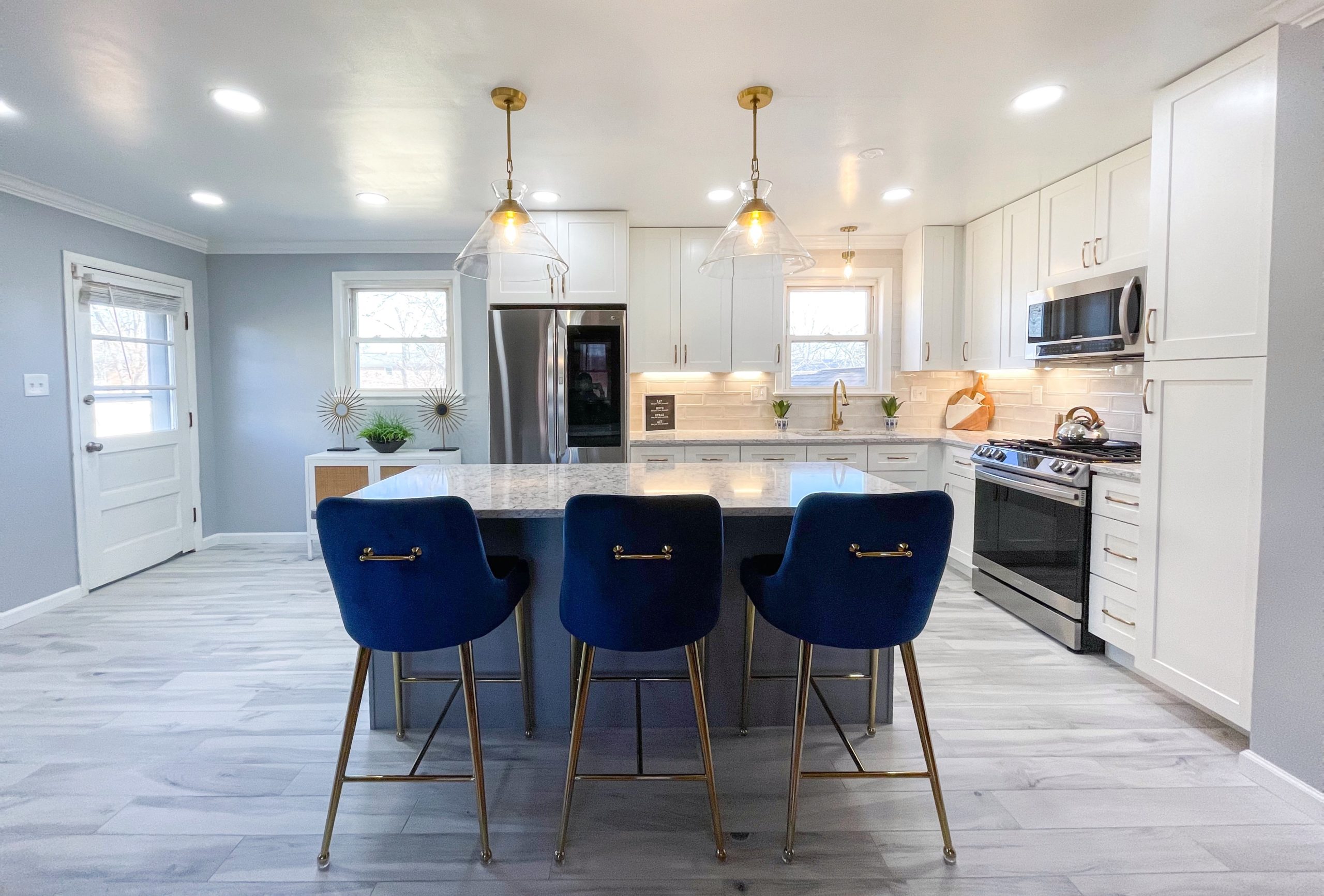
The kitchen remodeling before-after transformation blew everyone away. Those old oak cabinets disappeared, replaced by beautiful sage green shakers. The same small layout stayed, but the entire space felt completely different.
White quartz countertops replaced the old brown ones. Suddenly, the kitchen felt twice as bright. The sage green cabinets brought this fresh, modern style that made you want to spend time there. Gold brass hardware added just enough warmth to make everything feel like a welcoming space.
They kept the undermount sink but upgraded to a gorgeous gold bridge faucet. The white quartz backsplash created this seamless, clean look from counter to cabinet. Even the hardwood floors looked better against the new sage green white cabinetry.
This kitchen remodeling before-after proves you don’t need to change the floor plan to get dramatic results. Sometimes it’s all about choosing the right cabinet color and finishes for your existing kitchen.
2. Coastal Kitchen Dreams Come True
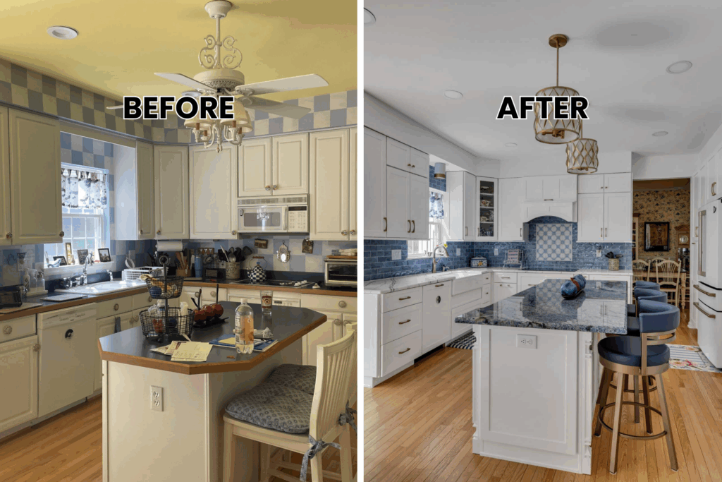
The second kitchen renovation started with a boring, personality-free cooking space. The homeowners wanted that coastal vibe for their family’s home, but had no idea how to get there. Plain white cabinets and basic finishes made the entire space feel like every other house on the block.
The kitchen remodeling before-after reveal was stunning. White cabinets went all the way to the ceiling, creating tons more storage space in the upper cabinets. But here’s where it gets good. They added this gorgeous subway tile backsplash that instantly brought the ocean indoors.
The kitchen island became the star of the show with blue granite countertops. Not just any blue – this beautiful veined stone that looked like ocean waves. They paired it with white quartz on the perimeter for balance. The large island provided extra prep space and created a natural breakfast bar for quick meals.
Bronze hardware and a farmhouse sink with a bronze gooseneck faucet completed the coastal look. The natural light from large windows made the hardwood floors shine. Walking into this beautiful kitchen now feels like stepping into a beachside cottage.
This kitchen remodeling before-after shows how the right color palette transforms the entire space. The open layout between the kitchen and dining room creates an inviting space perfect for entertaining.
3. Two-Tone Drama That Works
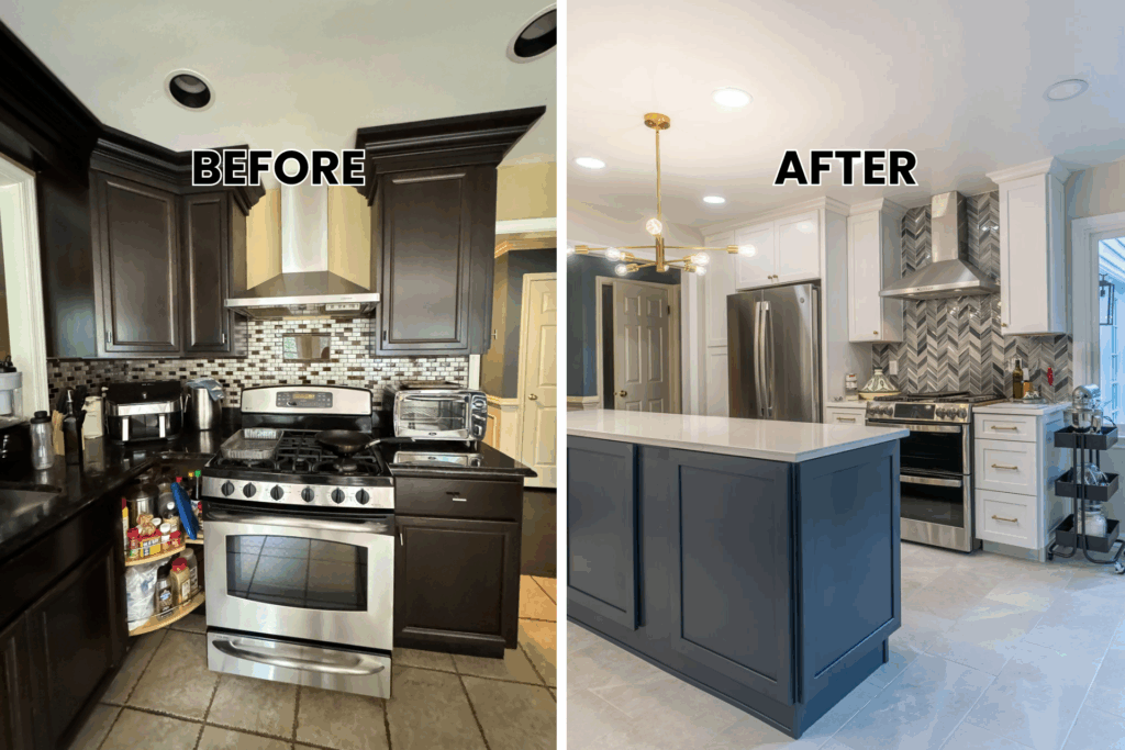
The third kitchen makeover tackled a functional kitchen that felt heavy and dark. All those dark cabinets made the space feel closed in and outdated. The homeowners wanted something sophisticated but not overwhelming for their family room area.
The solution? Two-tone cabinets that created amazing visual impact. White upper cabinets opened up the space and reflected natural light beautifully. Navy lower cabinets added the sophistication they wanted without making the cooking space feel dark.
The kitchen remodeling before-after difference was incredible. White quartz countertops kept everything bright and clean while providing ample counter space. The patterned tile backsplash became this gorgeous focal point that tied the two cabinet colors together.
Gold brass hardware throughout made both cabinet colors look expensive and intentional. The undermount sink and gold faucet matched perfectly. Even the neutral tile floors complemented the new two-tone look and efficient layout.
4. Light and Luxe in Bowie
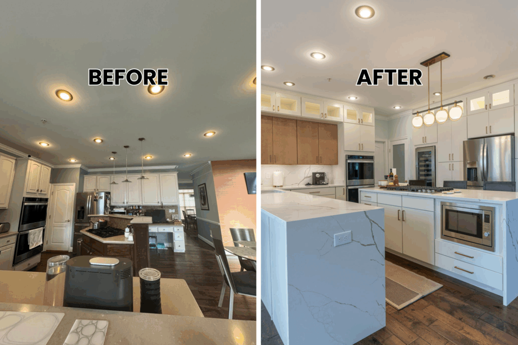
The fourth transformation started with a standard kitchen that lacked personality and luxury features. The homeowners wanted something sophisticated with stainless steel appliances but still warm and welcoming for their historic home.
The kitchen remodeling before-after reveal showcased floor-to-ceiling custom cabinetry that made the entire space feel grand. White upper cabinets with glass fronts and interior lighting created this gorgeous display area. Rich brown lower cabinets added warmth and grounded the design.
The white marble countertop with waterfall edges became the showstopper. The veining looked so real you had to touch it to believe it was quartz. A spacious large island with seating made the kitchen perfect for entertaining and created a natural breakfast nook.
Gold brass hardware and fixtures throughout elevated everything. The professional-grade cooktop and dual ovens turned this into a chef’s dream with better access to all cooking zones. Large windows flooded the space with natural light, while modern globe pendant lighting added evening ambiance.
This kitchen remodeling before-after shows how luxury details make everyday cooking feel special. The open space design connects the kitchen and dining area seamlessly.
5. Warm Modern in the City
This kitchen renovation needed warmth without losing its modern edge. The homeowners loved contemporary design but wanted something that felt inviting for their family room activities. The transformation featured custom wood cabinetry in rich medium tones that brought instant warmth to the cooking space.
The kitchen remodeling before-after difference was striking – suddenly the entire space felt both sophisticated and cozy. The original kitchen had an awkward layout, but smart layout decisions created better flow throughout.
Pristine white quartz countertops balanced the warm wood perfectly. The contrast created visual interest without being overwhelming while providing ample prep space. Professional-grade stainless steel appliances enhanced functionality while maintaining the modern style aesthetic.
A chrome gooseneck faucet over the undermount sink added that sophisticated touch. The thoughtful design maximized added storage with floor-to-ceiling cabinets while keeping everything open and airy. The new appliances fit perfectly into the efficient layout.
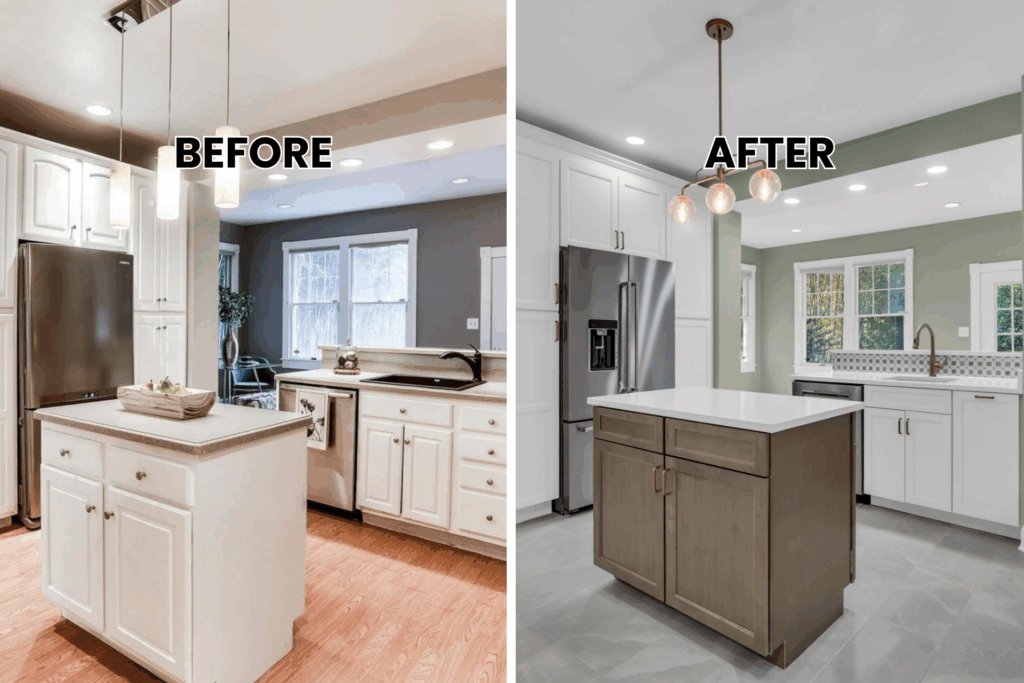
6. Sage Serenity in Silver Spring
The next transformation tackled a kitchen that felt disconnected and uninspiring. The homeowners wanted something fresh and calming but still functional for daily life. Crisp white shaker cabinets became the foundation, but here’s where it gets interesting. Sage green walls transformed the entire mood. The kitchen remodeling before-after difference was remarkable. Suddenly the space felt peaceful and inviting.
The central island in wood tones created a beautiful focal point. White quartz countertops kept everything bright and clean. The geometric tile backsplash added just enough pattern to keep things interesting without being busy. Bronze hardware and faucet brought warmth that complemented the sage walls perfectly. Gray tile floors grounded the design and hid everyday wear beautifully.
This kitchen remodeling before-after shows how wall color affects everything. The sage green made the white cabinets pop while creating this serene, spa-like feeling.
7. Classic Oak in Chevy Chase
This Chevy Chase kitchen needed better flow and storage without losing its traditional appeal. The homeowners wanted timeless beauty that would work for decades.
The kitchen remodeling before-after transformation featured flat-panel oak cabinets that brought warmth while looking completely contemporary. The natural wood grain added character without feeling dated. Soft-close hardware throughout made everything feel high-end. A large granite-top island became the heart of the kitchen. The gray and white granite countertops complemented the warm oak beautifully. The island provided extra prep space and casual seating for quick meals.
The updated tile backsplash added modern flair without overwhelming the classic oak. Beige walls created a neutral backdrop that let the wood shine. The metallic gray faucet and fixtures tied everything together perfectly. This kitchen remodeling before-after proves oak works in modern kitchens when you choose the right style and finishes.
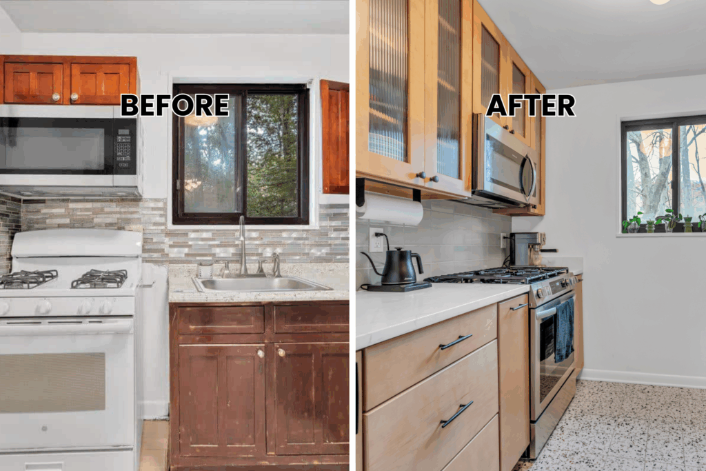
8. Cozy Maple Magic
The final transformation tackled a small Maryland kitchen that felt cramped and disconnected. The homeowners needed better storage and flow in their compact space.
Flat-panel maple cabinets with soft-close hardware maximized every inch of storage. The kitchen remodeling before-after difference was remarkable – suddenly this small space felt organized and efficient. White quartz countertops brightened everything and made the maple cabinets pop. The clean contrast between warm wood and crisp white created this perfect balance. Updated tile backsplash added texture without busy patterns.
Metallic gray fixtures throughout gave the kitchen a contemporary edge. The undermount sink and modern faucet looked sophisticated against the maple cabinets. White walls kept everything bright and airy. This kitchen remodeling before-after shows how small spaces work beautifully when you focus on smart storage and the right color balance.
What These Transformations Teach Us
Looking at these three kitchen remodeling before-after stories, you notice some patterns. First, cabinet color changes everything. Sage green brought freshness. White created brightness. Navy added sophistication. The right color makes your kitchen feel completely different.
Hardware matters more than you think. Gold appeared in two projects because it adds warmth and elegance. Bronze gave the coastal kitchen its authentic feel. Don’t underestimate how much the right hardware elevates your cabinets.
White quartz countertops showed up in all three transformations. There’s a reason – it brightens any space, works with every cabinet color, and never looks dated. It’s the safe choice that always looks amazing.
Backsplashes let you add personality. Quartz slabs create sleek, modern looks. Subway tiles bring classic charm. Patterned tiles make bold statements. Your backsplash is where you get to have fun with your design.
Your Kitchen Remodeling Before-After Story
These real transformations prove dramatic change is possible. You don’t need to knock down walls or start from scratch. Sometimes the biggest impact comes from smart material choices and fresh colors.
Your current kitchen has potential you haven’t discovered yet. Those outdated cabinets could become beautiful shakers in your favorite color. Those worn countertops could become gorgeous quartz that makes you smile every morning.
The key is working with professionals who understand how to maximize your space and budget. They see possibilities you miss and know which changes give you the biggest impact.
Your kitchen has potential you haven’t seen yet. Those outdated cabinets could become your favorite feature. That cramped layout could work better than you think. Let’s figure out what’s possible in your space. Call us to discuss your kitchen dreams. Your before-and-after story could be next.

